

Product Branding for SII
SII Skin Lab Product Branding – Clinical Skincare Identity SII Skin Lab approached us with a vision: to launch...
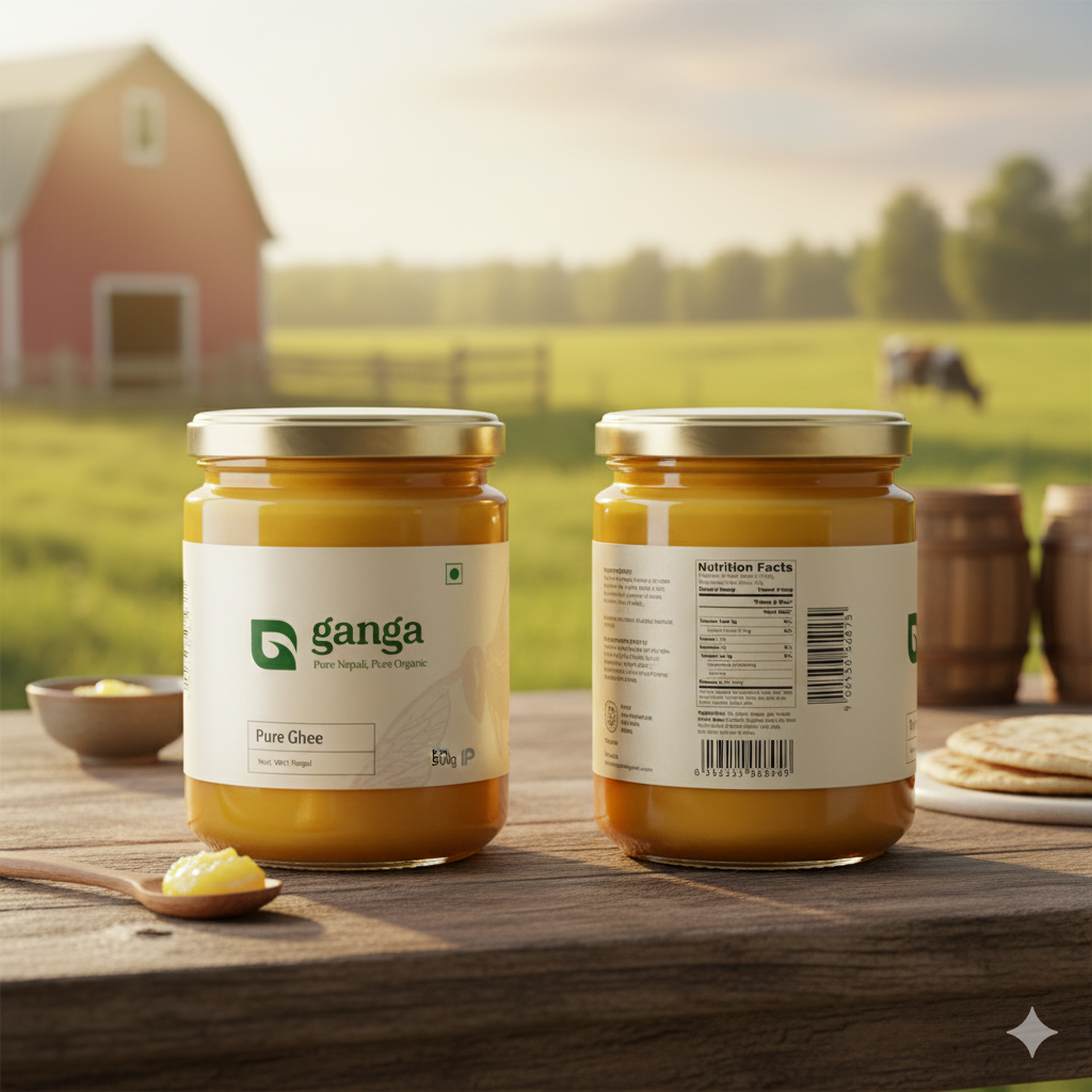
Ganga is a brand that stands at the intersection of purity, trust, and everyday relevance. Before beginning the branding project, the client approached us with a clear but challenging objective:
Create a brand identity that feels pure, modern, and rooted — something that communicates quality, reliability, and emotional connection.
The challenge was not just about creating a logo or packaging; it was about building an identity system that reflects the essence of the name Ganga — a name associated with purity, flow, and timeless value.
Ganga is a rising consumer brand aiming to expand across Nepal with products that prioritize quality. The company wanted a branding solution that would help them:
Build a strong identity that communicates trust.
Stand out on shelves in a crowded market.
Create a visual system that can scale across future products.
Build emotional connection with Nepali consumers.
When Ganga approached us, the brand had several challenges:
No cohesive brand identity (colors, typography, tone).
Low brand recall due to generic visual elements.
Packaging inconsistencies across products.
Lack of modern aesthetics needed to compete with global brands.
Need for a branding system that works both digitally and in physical retail.
These insights gave us the foundation to strategize a complete branding transformation.
Our approach began with a strategic research process, including:
Competitor research in FMCG and consumer goods.
Studying color psychology and market behavior.
Understanding Nepali consumer purchasing patterns.
Identifying core brand values (Purity, Trust, Consistency, Approachability).
Brand positioning: “Pure, Reliable, Everyday”.
From this, we created a branding direction that blends cultural relevance with modern simplicity.
We explored several visual directions, all rooted in the essence of Ganga. Our final concept represented:
The branding concept reflects both tradition and modernism, ensuring the brand remains timeless yet competitive.
The Ganga logo was designed to be clean, confident, and visually memorable.
Highlights:
Modern, minimal typography.
Subtle reference to water flow in the lettering.
Balanced spacing for visual clarity in all sizes.
Works beautifully on packaging, print, and digital placements.
The color direction focused on purity, calmness, and natural connection.
Primary Color: Aqua-inspired tone representing freshness and cleanliness.
Secondary Colors: Soft neutrals for flexibility and contrast.
Accents: Used to highlight product varieties or sub-brands.
We selected typefaces that communicate reliability and readability.
Primary type: clean, bold, modern.
Secondary type: simple and elegant for body copy.
Inspired by the gentle flow of water, we created:
Wave-based line assets.
Smooth, rounded shapes.
Patterns used for packaging and banners.
These elements help build instant recognition.
One of the strongest transformations happened in packaging.
We designed packaging that:
Stands out visually among competitors.
Uses clean layout and vibrant colors.
Includes clear product communication.
Looks premium and trustworthy.
Ensures consistency across product categories.
Packaging variations were made flexible so that the brand could expand to multiple SKUs in the future.
Alongside visuals, we crafted a communication style that is:
Clear
Friendly
Trustworthy
Value-driven
Messaging aligns with the brand’s core promise:
“Purity you can trust, quality you can see.”
We created taglines, product descriptions, and marketing copies that support consistent storytelling.
For modern brand presence, we delivered:
Social media templates
Product photography guidelines
Brand banners & ads
Website-ready visuals
Digital-first identity system
These assets make it easier for the brand to maintain consistency online.
After creating the full branding system, we worked with Ganga to ensure successful implementation, including:
Packaging production guidelines
Vendor coordination
Print-ready files
Social media rollout strategy
Store branding concepts
This step helped the brand transition smoothly into its new identity.
The rebranding of Ganga created measurable improvements:
Stronger brand recall in stores.
Increased consumer trust due to premium look and clarity.
Higher visibility in both digital and retail spaces.
Consistent brand communication across all platforms.
Better readiness for future product expansion.
Ganga is now equipped with a modern, culturally grounded identity that positions it as a competitive, trustworthy Nepali brand.
Ganga’s branding project was a journey of transforming a name with cultural purity into a modern consumer brand that resonates with the Nepali market. The outcome is a timeless, scalable, and impactful brand identity that balances heritage with modern strategy.
We are proud to have partnered with Ganga in building a brand that truly reflects purity, trust, and everyday value. Hoping for more collaboration.

SII Skin Lab Product Branding – Clinical Skincare Identity SII Skin Lab approached us with a vision: to launch...
We turn real moments into powerful stories that move people, grow brands, and create lasting impact.
Contact Us