

Ganga Organic Branding
1. Introduction Ganga is a brand that stands at the intersection of purity, trust, and everyday relevance. Before beginning...
SII Skin Lab approached us with a vision: to launch a line of skincare products that felt clinical, luxurious, and trustworthy—something that reflected their science-driven philosophy while standing out in the saturated beauty market. The challenge was to build a complete product branding ecosystem that communicated purity, dermatological credibility, and modern aesthetics from the very first glance. When we began the project, the primary objective was clear: create a visual and verbal identity that matched the brand’s promise of skin transformation backed by science.
We started with an in-depth brand discovery session where we explored SII Skin Lab’s core values, target audience, product benefits, and long-term positioning strategy. The products were designed for individuals who value clean aesthetics, premium quality, and result-oriented formulas—so our branding direction needed to embody minimalism, precision, and sophistication. After understanding the brand ethos, we developed the complete product branding framework, which included packaging design, label structure, typography hierarchy, brand color palette, ingredient storytelling, and messaging tone.
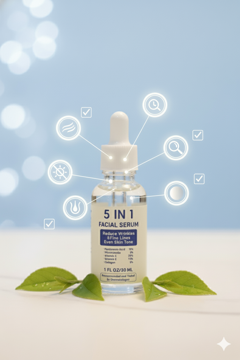
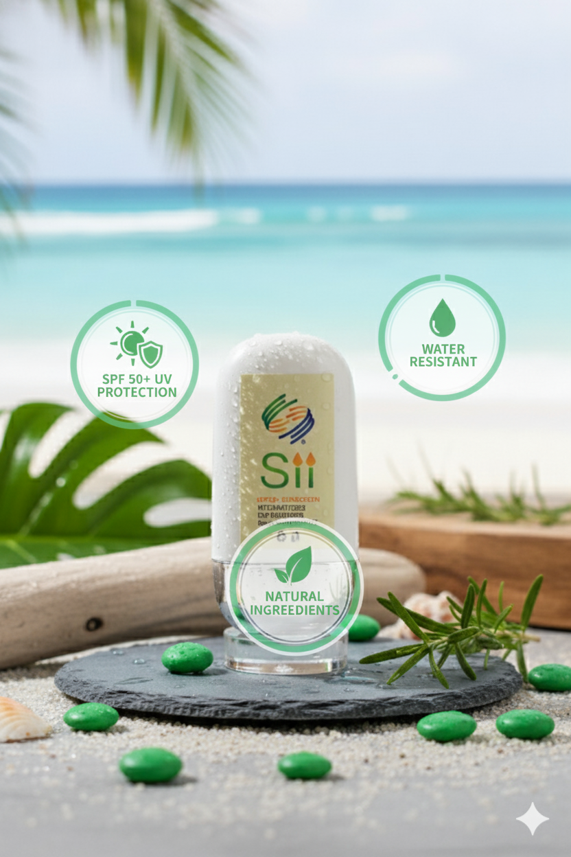
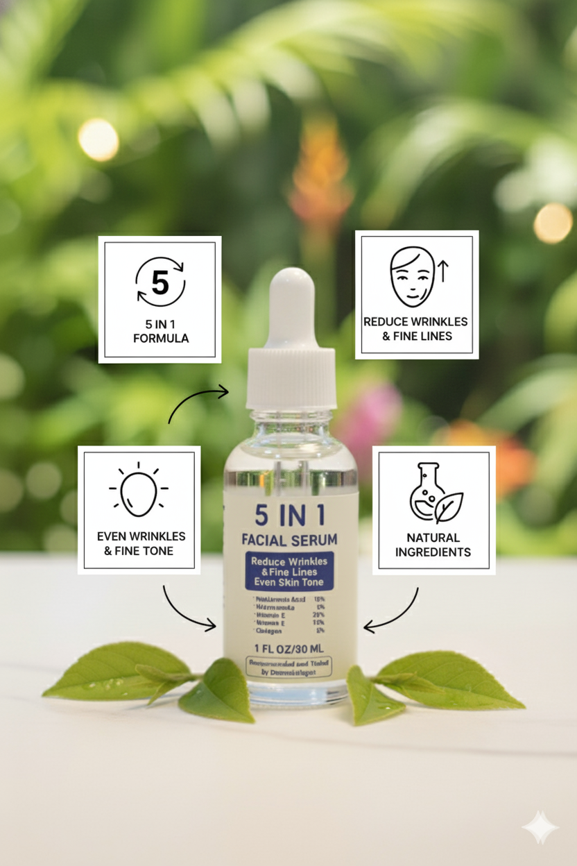
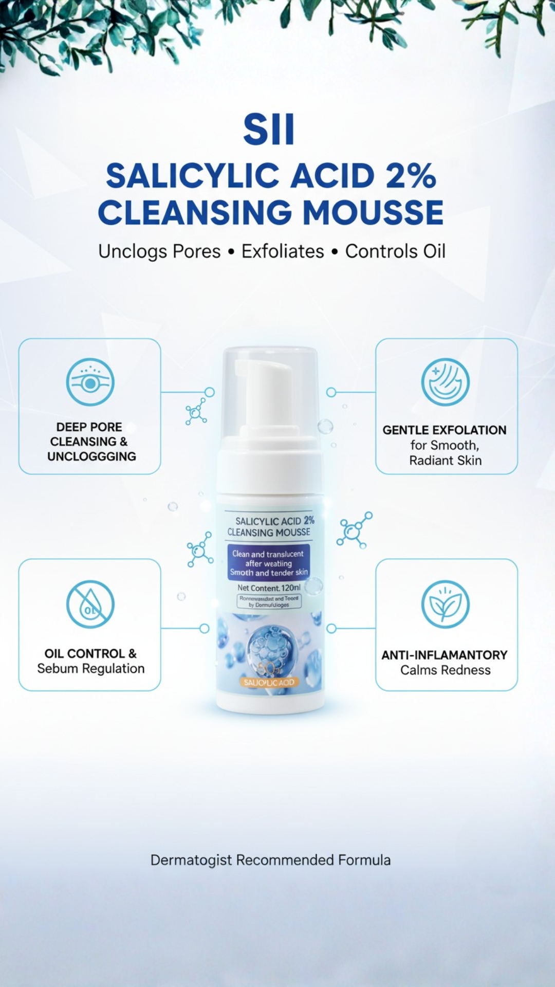
The visual direction embraced a clinical-luxury look: soft neutrals, muted tones, and clean typography that reflected both purity and professionalism. The packaging layout was crafted to highlight key ingredients, scientific benefits, and usage clarity—making the product feel both beautiful and trustworthy on the shelf. We avoided cluttered design elements and focused on clarity, letting the brand’s science-first identity shine. The label system was structured so that each product maintained its individuality while still fitting seamlessly within a cohesive product line.
Next, we shaped the verbal identity. We crafted product descriptions, ingredient highlights, and benefit-focused microcopy that felt educational yet elegant. Instead of overwriting claims, we took a transparent and value-based approach—communicating what the product does, why it works, and how it fits into a skincare routine. This ensured that the branding matched SII Skin Lab’s ethical and evidence-driven approach to aesthetics.
For launch visuals, we created a complete product branding photoshoot, producing high-quality images that showcased the textures, packaging, and premium feel of the line. The photography style used soft shadows, clean backgrounds, and balanced composition to amplify the brand’s minimalist design language. These visuals were later used across the website, social media, and marketing campaigns, creating a unified brand experience from discovery to purchase.
Within the first month of launch, SII Skin Lab noticed a significant increase in product inquiries and engagement. The brand’s aesthetic consistency allowed them to position their products as premium, science-backed solutions rather than typical beauty goods. Customers appreciated the clean packaging and clear communication, leading to improved trust and stronger brand loyalty. The new product branding helped SII Skin Lab elevate its identity from a service-based clinic to a modern skincare brand with long-term commercial potential.
This project stands as a strong example of how thoughtful branding—rooted in clarity, consistency, and consumer psychology—can turn a product into a premium experience. For SII Skin Lab, product branding didn’t just shape how the products looked; it shaped how customers felt, trusted, and connected with the brand.For such growth contact us.
1. Introduction Ganga is a brand that stands at the intersection of purity, trust, and everyday relevance. Before beginning...
We turn real moments into powerful stories that move people, grow brands, and create lasting impact.
Contact Us